Paper-quality figures

This post presents a few guidelines on how to prepare graphs (in Python) for a paper or a thesis
General Tips
- Always think of the information/space ratio: given the space my figure is taking, am I giving enough information?
- I heavily recommend using Jupyter notebooks for the figures.
- Figures take a lot of time: don’t underestimate the number of iterations.
- Take the time to review the state of the art and understand what are the best ways to present your results.
Notebook Management
- Use one notebook per figure/graph. You will have to iterate a lot on the figure and large notebooks tend to get messy.
- In case of heavy computational load, split the data analysis and plot into two different notebooks so you don’t need to recompute the data every time.
Data Management
- Save the data in the “rawest” format possible. For instance, only saving the mean or any other aggregated version of the data removes the possibility to later on infer other statistics.
- In case you have complex data (more than a 1D array), use
pandas. Always specify the unit in the name of the column.
Figure Design
- A figure should have a clear message to convey, and the presentation of it should reflect that.
- Unless in some very specific cases, avoid 3D plots. 99% of the time, a better 2D representation is possible.
- Always label your axis “label [unit]”.
- The font should be readable without zooming. Don’t go below size 7.
- Don’t add a title to your figure. Use the caption to describe it (unless the figure contains several graphs/subplots).
Color Usage
- Never use ‘r’, ‘g’, and ‘b’ colors. Instead, use CSS colors.
Paper-quality Figure
Load the following code in your first Jupyter cell to set up the correct font and font sizes:
import matplotlib.pyplot as plt
import matplotlib as mpl
plt.rc('font', family='serif', serif='Times')
plt.rc('text', usetex=True)
plt.rc('xtick', labelsize=8)
plt.rc('ytick', labelsize=8)
plt.rc('axes', labelsize=8)
A well-prepared figure should not require resizing in LaTeX. Instead, it should have the correct size from the start to prevent random rescaling of fonts and other elements.
To determine the width of a column, use the command \the\linewidth in your LaTeX document. This command will display the width in points (pt), which you can then convert to inches or centimeters.
The following example assumes you are using the IEEE conference double-column template. Adjust the width if you are using a different template.
While there is no consensus on the aspect ratio, the golden ratio is a good standard. You can use a lower ratio (less height), but avoid a higher ratio as it will take up too much space.
WIDTH = 3.402 # inches
HEIGHT = WIDTH / 1.618 # inches
From there, create your figure as usual. In the last cell, include:
fig.set_size_inches(width, height)
fig.subplots_adjust(left=0.14, bottom=0.02, right=0.99, top=0.98)
plt.savefig('mapping_violins_rpe.pdf', dpi=300)
Tune the parameters of subplot_adjust so that the exported pdf does not crop the labels and have as little white space as possible.
Should I Rasterize My Figure?
Avoid rasterizing your figure unless it contains a large number of points and the PDF reader takes a long time to load the figure.
If you wish to rasterize a part of the figure, simply add the parameter rasterize=Truein the corresponding ax.scatter.
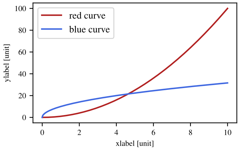
Full example
import numpy as np
import matplotlib.pyplot as plt
import matplotlib as mpl

plt.rc('font', family='serif', serif='Times')
plt.rc('text', usetex=True)
plt.rc('xtick', labelsize=8)
plt.rc('ytick', labelsize=8)
plt.rc('axes', labelsize=8)

WIDTH = 3.402 #inches
HEIGHT = WIDTH /  1.618 #inches

#generate dummy data
N=1000
data_x = np.linspace(0,10,N)
data_y1 = data_x**2
data_y2 = np.sqrt(data_x)*10


#plot
fig = plt.figure()
ax = plt.gca()

ax.plot(data_x, data_y1, color='firebrick', label="red curve")
ax.plot(data_x, data_y2, color='royalblue', label="blue curve")
ax.set_xlabel("xlabel [unit]")
ax.set_ylabel("ylabel [unit]")
plt.legend()

fig.set_size_inches(WIDTH, HEIGHT)
fig.subplots_adjust(left=.14, bottom=.17, right=.99, top=.98)
plt.savefig('minimal example.pdf', dpi=300)